And the winner is!...
As part of our process, we asked registered CRFMHA players to submit name ideas to our "Name That Team" Contest. All players were then asked to vote in a series of elimination rounds to select their favourite name. 133 unique name submissions were received and nearly all players participated in voting. CRFMHA’s Name That Team Contest Winner was Ruby Jones – Congratulations Ruby!! Ruby played for free in the 2019-20 Season.
Victoria Reign was first introduced as a team name when the concept of a female MHA for greater Victoria (Capital Regional District) was first publicly introduced on April 1, 2017. The name respects the history of the city, which is named after Queen Victoria. It is also acknowledgement of recent incarnations of local female programming that used references to royalty, such as "VIAHA Royals" and "Vancouver Island Monarchs". Reign was a specifically popular name, as it was submitted to the naming contest independently by SIX different players (as well as a handful of other similar themed entries such as Matriarchs, Queens (2); Regals (2), Royal Blues, Royals (3) and Victorians).
New logos and jersey design
CRFMHA worked with Ken Jones of Jones Creative (
www.jonescreative.ca) to create the logos and jersey designs. Ken is a CRFMHA parent, coach, and has over 20 years of professional experience in brand development and design, including having worked on creative projects for the Vancouver Canucks, BC Lions, Abbotsford Heat, and locally, the Spectrum Hockey Skills Academy. He approached this creative challenge as an opportunity to create a lasting hockey brand that girls in the Capital Region can connect with and take pride in while wearing their new association’s hockey uniform – a brand to define the strength and tenacity of female hockey players in Victoria. CRFMHA’s Communications Committee worked with Ken on imagery, creative ideation and colour, and are proud to present our new logos and team jersey design.
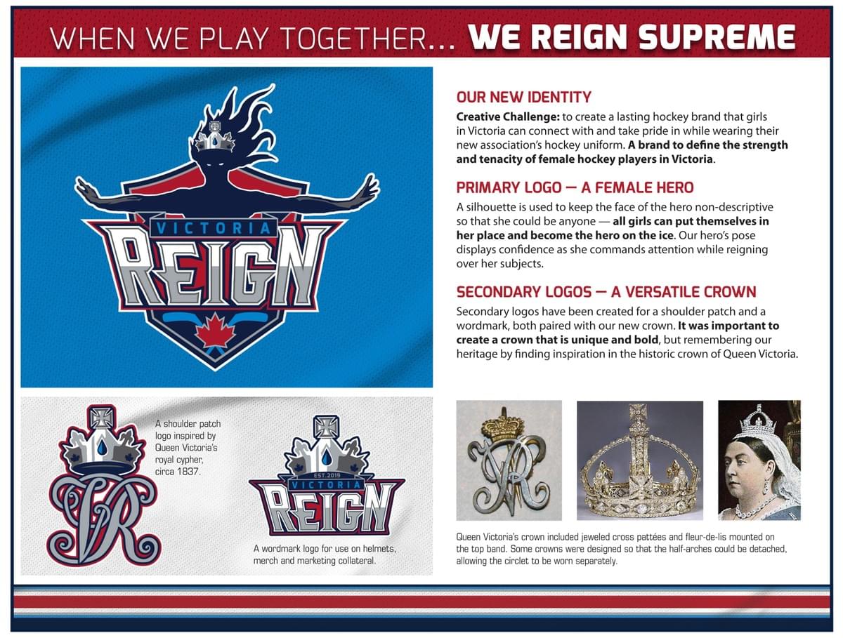
Primary Logo – a strong female hero
A silhouette is used to keep the face of the hero non-descriptive so that she could be anyone — all girls can put themselves in her place and become the hero on the ice. Our hero’s pose displays confidence as she commands attention while reigning over her subjects.
Secondary Logo – a versatile crown
Secondary logos have been created for a shoulder patch and a wordmark, both paired with our new crown. It was important to create a crown that is unique and bold, but remembering our heritage by finding inspiration in the historic crown of Queen Victoria. The shoulder patch is inspired by Queen Victoria's Royal Cypher and can serve as an alternate logo for a "third" jersey.
The Jerseys
A bold palette with a consistent stripe pattern was needed to create home and away jerseys, but also provide versatility for other future association sweater options. We aimed for a colour palette that did not conflict with other female MHAs. The palette allows for recreational House league teams to potentially wear Navy, Red or even Grey jerseys as our numbers grow over time.
Thank you to the many CRFMHA players who participated in our Name That Team Contest. Special thanks from CRFMHA’s Board of Directors to Ken Jones, who volunteered his time and expertise to bringing our vision to reality. To see some of Ken’s other work, please visit him on the web at www.jonescreative.ca.

 Email
Email Print
Print